
Yes, you heard me right. The Maybank2u new interface is back today, on the 1st day of December, good timing I suppose. If you could still remember, Maybank2u reverted back to the old classic version close to two months ago due to some unconfirmed reasons. Some say it was because of difficulty for users to use, and some say it could be due to the new system’s instability.
Anyway, today when I tried to transfer some funds to an associate, the response and user experience was pretty good.
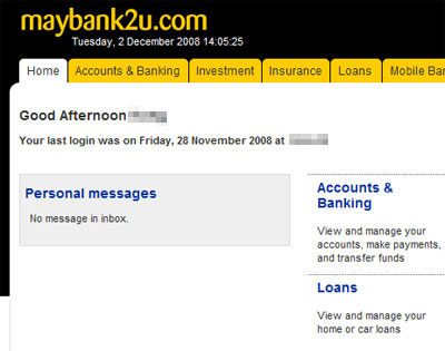
That’s the new welcome screen that greets you right after you login.
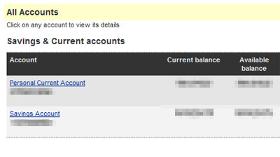
The new interface is certainly sleeker and neater. I can clearly see I have so much cash in my bank accounts! 🙂
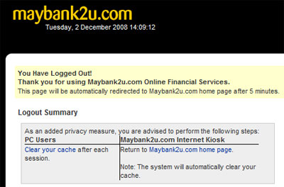
The logout screen. Slow? No more… it’s a breeze to transact online now!
The new Maybank2u website is pretty user friendly for me, although I think most users will need some time to familiarize with all the new links, buttons and menus. However, if you do need some help, you can head over to the All-you M2U blog site and watch the video demos.
Now, tell us what do you think of the new interface. Do you like it or you still prefer the old classic version?